10 best practices to create compelling CTAs on your website
03 February, 2022
4 mins
For last Christmas, you put on a great spread: 8 hours of cooking in a row! Nice one! The problem is, you were so obsessed with th...
Read more
Stay tuned thanks to our Newsletter
Ted sent hundreds of invitations for New Year’s Party but wonders why none get a positive response. Let’s see… The letters were more than 500 words each; weren't signed and he forgot to mention his address. That makes 3 reasons why people have thrown his invitations away without answering. Were there other problems? Was the color too brownish?
Like Ted, you may have issues writing engaging copies, converting landing pages or emails people answer; but that’s no big deal. What if the solutions didn’t rely on reading thousands of books about conversion rates optimization but making simple A/B testings?
Today we’ll discover how to run 5 easy A/B tests to improve your conversion rates. You can still revise your basics on How to improve your copywriting strategy thanks to CRO? if you want to become an expert in the subject.
It is used in the marketing field to test the effectiveness of a digital campaign. In concrete terms, it consists of testing variations of a campaign (CTAs, wording, image, colors…) by showing a version A to one half of your audience and a version B to the other half; in equal parts.
Then, by analyzing the results, you find which version is more likely to convert and learn from this experiment to build your conversion rate optimization good practices.
Want more advice? Discover Hubspot A/B testing checklist to make the perfect split test.
You can use A/B testing to test your efficiency or understand what influences your customers’ purchase behavior.
For instance, if you want to improve the UX of your website. When you start asking questions like: Why don’t people buy from my e-commerce site? Why is my bounce rate that high? It’s time to start creating different declinations of your pages’ main elements (photo, text, headline, CTAs…) so you can test and analyze them.
 Source: https://www.mailjet.com/blog/news/ab-testing-beginners-guide-for-email-marketing/
Which one do you think got the better results?
Spoiler alert: it’s the first one. Why? The CTA is shorter and more precise, the title is more concise, there is color...
It seems obvious, right? To have someone stay on your website or read your offer description before subscribing, you need to convince him. What A/B testing can you do to find what converts the most to your audience?
Try:
Think about both variations of the content and the shape of your text. Make regular tests to see if your metrics change!
At the time of improving your conversion rate, one of the most essential elements of your page is your CTA. You can’t expect to boost your conversion if your Call to action isn’t optimized.
Try different CTAs to see which gets the most conversions. Test different:
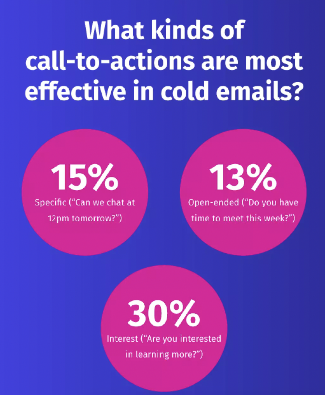
Let's see what kind of CTAs work best for cold emails for instance: specific, open-ended questions with seek people's interest.

Discover more about cold emailing best practices in this Postaga article.
M-commerce sales have increased from 22.3% in 2021, and it’s just the beginning. With more and more people consulting your website from their mobile devices, it’s essential to adapt your pages to this format.
Tips: you can try to add a carousel to your page to prevent never-ending phone scrolling.
Make your page navigation more intuitive if you don’t want people to leave your website after the first few seconds. What should you test? Well:
If you want more details on where your website’s visitors focus their attention while scrolling through your website, you can use Hotjar.
You want to analyze your page speed? Try the free tool PageSpeed Insights.
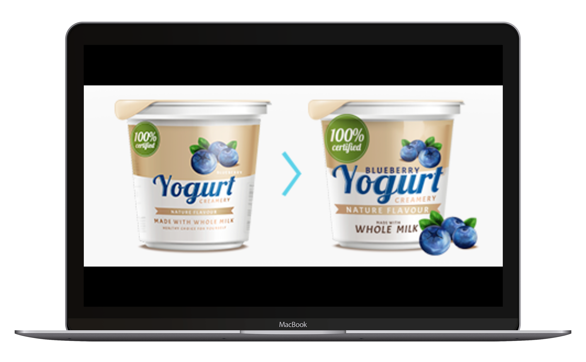
Which product would you add to your basket?

source: https://www.optopus.eu/home/
Think about the influence of your website design and products or services visual optimization when you want to increase your conversion rate.
In fact, we process visuals 60,000 x faster than text. To help people distinguish your corporate identity from your competitors, make sure to add your logo, brand’s name and colors.
It’s not what you should do. To be able to analyze the impact of one single variation on your conversion rate, you should:
A/B testing seems accessible to all, but to generate good results and automate your testing process, it can be helpful to call on CRO experts. Want to improve your conversion rates?
Besides, A/B testing isn’t only beneficial to optimize your conversion rates… It can also:
And you, what do you do to increase your conversion rate?
By Emma Jeanpierre
10 Feb, 2022