
Is it possible to run profitable Ads campaigns without CRO
03 March, 2022
3 mins
Know how superheroes fly? Wings? Nitrous oxide propeller? Give in? Well, we don’t know either. But what we know for sure is that i...
Read more

Stay tuned thanks to our Newsletter
For last Christmas, you put on a great spread: 8 hours of cooking in a row! Nice one! The problem is, you were so obsessed with the turkey that you forgot to put silverware on your table clock… and now the turkey is cold. Don’t ruin all your efforts by missing the detail that can make all the difference.
That’s the same for your last marketing campaign! You spent days revamping your website but didn’t pay enough attention to your CTAs… And now, you wonder why your average conversion rate is close to zero.
Call to Actions are essential in inbound marketing: “download for free”, “sign in now”, “read more”... You’ve seen all these buttons on websites but don’t click on all of them, right? Let’s discover why Call to actions are compulsory on your platform and how to create converting CTAs.
In the marketing field, a Call to action refers to the action the marketer wants you to take. In concrete terms, it is direct instructions that help you know what to do if you wish to subscribe to a newsletter, buy a product or download a white paper…
A call to action, usually takes the form of a button and redirects the consumer from a page to a landing page of your choice.
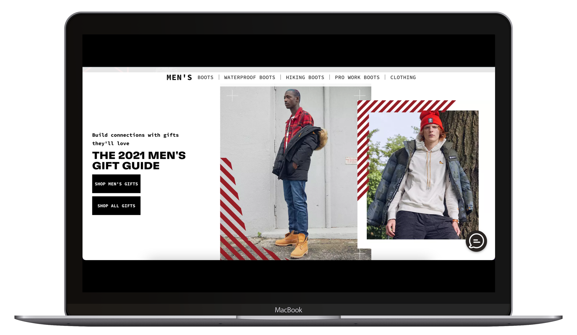
For instance, here are 2 CTAs that simplify shopping on the Timberland website since it split the article into categories of items. The more intuitive the navigation, the better it is for the users. They won’t be lost in the middle of hundreds of articles that don’t interest them.
Let’s take another look at this example: the two CTAs ease the purchase experience of the customers since they know where to click if they want to buy “men gift” or “all gift”. Without CTAs, your buyer personas are less likely to convert on your website.
In a nutshell: if you want to convert more leads, don’t hesitate to guide them to the landing page of your choice. Hubspot designed just for you a guide of 40 Call-to-action you can’t help but click, to inspire you. CTAs are just a section of conversion rate optimization strategies. Learn more tips to improve your website conversion rate thanks to CRO.
Now that you know what CTAs are and why you should consider them to boost your conversion rates; let’s get down to business!
Where to put your CTA? Thanks to tools like Hotjar, you can see where people focus their attention when they navigate through your pages. Try to put your CTAs on these spots in your consumers’ eye path.
Large buttons are more likely to be noticed and thus, clicked on… But don’t get us wrong: there’s a limit. According to Apple, buttons should be 44x44 to suit both computers and mobile devices.
Tips: using 3D effects can bring a desire to push the CTA.
A/B testing is a great solution if you want to make your CTAs more compelling.
What to test? Try variations of:
There are so many things you should try!
Tips: test a CTA for a month or so before changing it! It’s essential to let a CTA on for a certain period of time to be able to analyze the results.
Create target CTAs that correspond to your different personas but don’t multiply them! Personalized CTAs perform 202% better than other CTAs.
Tips: find color coding for your website and stick to it! For instance, choose a color for subscription CTAs, another one for downloading CTAs...
How can your website visitors find them if the information is completely blended? According to Wordstream, emails with ONE CTA increase sales by more than 1500%! That is the same for your website pages… Don’t flood your pages, otherwise: people won’t understand your added value.
Ok but how?
When guiding a potential customer to take action, you should always try to be consistent:
Minimum wording: maximum impact! That’s not easy, we know but your CTA copywriting is essential. Make sure to:
You know clickbait, right? Try to avoid making fake promises. You would have a high click-through rate but a poor conversion rate.
People don’t want to land on your homepage. Your CTAs must ease their navigation so try to send them to the specific page that will meet their needs.
To sum things up, here is an example :

The signup CTA is :
70% of small business B2B websites lack Call to Actions, so make the difference!
Now that you know how powerful CTAs are, you have no excuse to start benchmarking forms, fonts and wordings that would suit your pages’ CTAs. You think it’s too time-consuming? Have no inspiration to start? Don’t hesitate to call on our team. They’d be happy to help you rock your conversion rates! And you, what’s your favorite best practice?
03 Feb, 2022